Thursday, September 30, 2010

Day 20: IKAT


Today I wore my little black skirt, silver flip flops, a charcoal tank top and my favorite Ikat scarf by Society of Scarves. Scarves are an easy way to dress up my outfits, and really nice to have in the cool mornings and evenings for a little extra warmth.


If there is one print that I never get sick of, it's Ikat. I love it in all colors. I love it in throw cushions, clothing, accessories, carpets. I love everything about it.
Ikat is an Indonesian language word, which means the method of weaving that uses a resist dyeing process similar to tie-die. Ikat is a near universal weaving style common to many world cultures. Likely, it is one of the oldest forms of textile decoration. Ikat weaving styles vary widely. Many design motifs may have ethnic, ritual or symbolic meaning or have been developed for export trade. Traditionally, ikat are symbols of status, wealth, power and prestige. Because of the time and skill involved in weaving ikat, some cultures believe the cloth contains magical powers.

Here is the black lines through the painting inspired by the ikat print of my scarf.


Wednesday, September 29, 2010

INSPIRATION by Tricia Guild


This book is like a millions blinks of the human eye ball. It's a lovely book filled with color, imagery, objects, artists, and designers.

Tricia Guild founded Designers Guild in London in 1970, which has become one of the most influential and creative forces in the world of interior design. Her book, INSPIRATION has case studies on designers such as Arne Jacobson, sections on subjects like Modern Furniture, and blurbs on lovely cities such as Venice. She narrates the the book through gorgeous images, all color coordinated. From tiny thumbnails to enlarge detail of images, she stimulates the viewer through captivating all of her passions. From art & music, to architecture and designs, food, flowers & gardens, texture & form, light and shadows, and color. It is beautiful.


Day 19: Tanned Leather


In Santa Cruz we are having a great Indian Summer with 90 degree weather at the very end of September. It has been so hot, I am back in my Summer wardrobe. Today I am wearing an 88 Orange organic cotton tee in a citrus yellow, brown pin stripe shorts, my favorite beige cardigan, rainbow flip flops, and my Nuala purse.

I went back into the painting and drew from the color I painted on Day 13: Beige on Beige, and made an evelope of the warm tanned leather color my bag is.

I then went back into the purple and painted more of it because I felt it was too jumbled. I let the drips go through the tan.


Tuesday, September 28, 2010

Day 18: Naturally off-white


This is a nice casual outfit that was simple; Kasil jeans, Clarks Wallabees, off-white Market tee, and an infinity scarf.
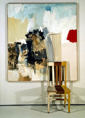

Wallabees are the most comfortable and practical shoes. I love that they look great on men & women. Look at my new Mid-Century patio chair I just found!

Here is the off-white in the painting. I began with a base coat of a taupe and then scribbled white china-marker over the thick paint until it was a nice shade of off-white.


Sunday, September 26, 2010

White Facets as a Multimodal Project


I don't know how to describe the gratitude and appreciation that I have after reading one of my closest friend's blogs about me and my blog. Halley is attending De Paul in Chicago and is taking a class in New Media Studies: Text and Image. She did a case study on how White Facets acts as a Multimodal blog for her masters in Interdisciplinary Studies.

I couldn't have given myself a better background story. She really nails me on the head.

It's such a weird feeling as you read words describing yourself, and you're intrigued! Needless to say, I am truly flattered and love that we were able to cross paths in cyberspace through our blogs.

Skip on over to her blog and start reading her words of wisdom. Click Here.


Meet my friend Halley Miglietta:
Look forward to hearing more of Halley's wise words and perhaps a collaboration project in the future!

Thursday, September 23, 2010

Obsession: Whistles


I have always had an obsession with whistles. From my first set of keys at 16 years old, to whistle necklaces being given to me (Thank you, Trista), to a vast collection, I have always had a love of whistles. I have a small shelf in my living room filled with vintage ones and a row of them tacked to the wall below. I have them on every set of keys now and a line of minature whistles on chains I wear around my neck. Something about the security of owning a whistle, like it's my weapon of safety. Perhaps it's just their functionality. I love police whistles, railroad whistles, boyscout whistles, military whistles. I love them all.

Wednesday, September 22, 2010

Day 17: Pinky Orange


Here I am wearing this fun, bring tee shirt oddly by Joes Jeans. I have it paired with my Citizens of Humanity jeans that are on their last legs, my Nuala purse (made locally in Santa Cruz) and my gladiator sandals that I have recently been told that I need to throw away because I wear them too often on my blog.... Note taken.

I have done the first layer of the orange on the right hand side, covering the darker orange chunks. Inspired by the pinky coral, I ended up putting more of a raspberry paint color super think over the orchid pink section of the painting.
Here is the closer look to see the texture. Next step after it dries : more orange!

Day 16: Teal Teal


This is an easy go-to outfit. I'm wearing my favorite jeans that I've literally worn to death, a black thermal long sleeve tee, Market infinity scarf, and Saltwater sandals. The teal was again inspired from my tribal rug in my kitchen.


Of course I began getting sad at the lack of white in the painting, so I scribbled some back into the surface, and dripped some more on top. I started a little bit of orange on the right hand side. I peeled some old paint off of my palette and glued it back on to the canvas. Tomorrow, looks like I'll be wearing orange to finish off that inspiration....


Day 15: Pea Soup Green


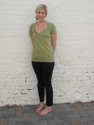
Here is the first color drawn directly from my tribal rug. I just so happened to have a t-shirt in almost that pea soup green. I paired it with black trousers and nude/pink Melissa recycled plastic shoes!! Look at these adorable shoes, a modern take on a glass slipper:

Here is the incorporation of the green into the painting:


Inspiration: My Tribal Rug


I absolutely love ethnic rugs...and I finally scored this really old, but beautiful one. I love the turquoise, pink, pea green, orange, black, and white. The pattern is so simple, yet really ornate. I sit and eat breakfast every morning staring at it's color, pattern, and complexity. It will definitely be my inspiration for the week...


Monday, September 20, 2010

Day 14: Silver shorts!


I came across these darling silver shorts that I simply couldn't pass up. They remind me of grandpa swimming trunks the way they are cut, but awesomely they are in a shiny silver print. I am also wearing my favorite v-neck by Market, and my lovely black jersey wrap blazer my boyfriend got me as a gift and strappy black sandals. My purse is by Ashley Watson who recycles leather jackets into purses in Vancouver, BC.

Here is silver introduced into the painting:


Obsession: Vintage Coffee Pots


I found one of these 50's glass coffee carafes and thought that they were so cool. It almost looks like it's from chemistry class. I used it around my house as vase, and then I started finding them constantly... almost like fate. I became obsessed with their bakelite handles, the metallic designs, and the more I found, the more differences I could find. Now 24 of them frame my kitchen proudly. I custom built a shelf that in my dining area to display all of them.


Silver.

Silver is precious. Glittery. Abrasive.
Silver is the color of shiny chrome.
Nails.
Alloy.
SOS pads.
Airplanes.
1950's military desks.
Utensils.
Tea pot.
Skeleton Keys.
Faucets (taps).
Spurs.
Silver Fish.
Tin Cans.
Whistles.
Door handles.
Airstreams.
Scissors.
Pie tins.
Anchovies.
Aluminum foil.
DVDs.
Whistles.
Sterling.
Quarters & dimes. Half dollars and Susan B. Anthony coins.
Aersol cans.
Swords.
Steel.
Titanium.
Sheet metal.
Second place.

Silver is one of the most striking colors. It's metallic nature reflects so many other colors. Fact: Pale silver is a color in Crayola Crayons. It's not a neutral grayscale color, but it is a warm gray with a slight tone of orange-red. Andy Warhol died his hair silver for many years.

Saturday, September 18, 2010

Day 12: Bandaid Pink


I was thrilled when I found this top while visiting my friend in Chico, CA at the Good Will for only $1. It's this lightweight nubby linen fabric in a pretty peachy bandaid pink. I paired it with my black stretchy skirt, a skinny belt, and gladiators.

After mixing the paint to match the shirt, I added in a ton of this fine grit sand and glue. This made the paint thicker, and added a nice texture that reminisced the nubbiness of the shirt.


Friday, September 17, 2010

Day 13: Beige on Beige


Of course there is NEVER enough beige in my life... I am wearing a H&M beige shirt dress, my Hurley black leggings, and those killer vintage boots I adore. I am also wearing one of my most prized possessions: my vintage purse that was my grandmother's.


Day 11: Burgundy


This a lovely new top by Line & Dot. I never wear this color, but I'm really liking this dark wine, burgundy at the moment. It's rich, sophisticated, and great for fall! I paired it will my black Hurley leggings and vintage oxford laced riding boots (one of my favorite things on earth!).
I started by adding a piece of really dark purple sand paper that I ripped up... and then adhered it to the painting.

Then I painted over the glue... and let it dry...


Then I drew with oil pastels back into the sand paper to get the texture and then painted that lovely mustard yellow back over the burgundy.

Thursday, September 16, 2010

Artist: Robert Rauschenberg


Robert Rauschenberg's "White Painting"


b. 1925-d. 2008

Robert Rauschenberg studied at the Kansas City Art Institute and the Black Mountain College in North Carolina. Rauschenberg was both a painter and a sculptor, often combining both medias. He also worked in photography, printmaking, paper making, and performance arts. Rauschenberg was quoted as saying that he wanted to work "in the gap between art and life." He questioned the distinction art objects and everyday objects.

Rauschenberg picked up trash and incorporated found objects such as newspapers, into his paintings, often beginning with quilts and other items as his canvases. He liked the surprise of the objects, and the transformation of the object by changing its context.

I love the series that Rauschenberg created in the 50's known as his "White Paintings." They were large panels of mostly layers of white paint. They were referred to as "airports for the shadows and for dust, but you could also say that they were mirrors of the air." I love the exploitation of white, and the bravery of calling pure white a work of art.

Rauschenberg was a brilliant artist in all formal terms. He had great compositions and use of space, color, texture and shapes. Look at the incredible use of hot neon pinks!

This is one of Rauschenberg's paintings I saw at the Philadelphia Museum of Art.

Pilgrim, 1950

Look at this work titled Pilgrim, that spills into the gallery. It was so strange stumbling across this image years after completing my installation. Weird, huh?

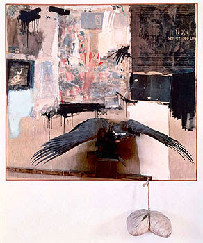
Canyon, 1959

Look at this mixed media. He uses a taxidermy bald eagle and a pillow hanging from the canvas. It's odd how mysterious and haunting, yet so incredibly beautiful his work can be.


Octave, 1960

Just one more example of his work. When he could not afford canvas, he simply took his quilt off his bed and use toothpaste, paint, and nail polish to create this piece. Here you can really see his choreography, improvisation, and the use of painting, sculpture, and everyday object.

Day 11: Black by Day

This is just a simple American Apparel dress paired with a beige belt with an arrow closure and my little gladiator flats.

This is the first real saturation of black into the painting (in the left bottom corner). I took an old pen and scratched the surface to break it up the transition a bit.